Friday, October 30, 2009

Design in Quilting


Design is something that embodies our lives everyday. When making a design, a designer or artist usually uses inspiration from their own lives and incorporates it into their design. In this piece by Avis Robinson Collins entitled Piano Keys, 2009, Robinson suggests to the viewer that this quilt is about a piano. Without any description of the piece, it is obvious that the subject is in a fact a piano, by its title, and by the shapes used in the piece.

The vertical lines in the piece are similar to the shape of piano keys on a piano. The vertical lines may also suggest the horizontal lines on sheet music. There are a variety of lines on the quilt; each different lengths, and colors. Without seeing the title of this quilt, I thought it was an abstract composition of a wheat field. But when I read the title, the colors and the shapes used made perfect sense.

This piece has a great sense of rhythm to it as well. The alternation of long vertical strips and short vertical strips create an interesting composition. There is a rhythm of the colors in the piece as well. There is a great comparison of light and dark colors, which creates a great sense of emotion as well. There is a sense of staccato within the piece, which is nicely juxtaposed with the idea that this piece relates back to music. There are changes in the pattern, but they make sense because of the alternation of sizes in the pattern. There is growth in the pattern, which is a sense of progressive rhythm. Even though the pattern is not organized in size order, the varied sizes and colors created an emotional and almost musical pattern.

By creating a juxtaposition of music, and art, Robinson creates an interesting and modern take on quilting. The piece de-contextualizes the piano and creates an emotional connection rather than a literal one.


Image: Piano Keys,
Avis Robinson Collins, 2009, Nelson Gallery, U.C. Davis

Thursday, October 29, 2009

Quilting with Texture


Currently in the Nelson Art Gallery at U.C. Davis, is the African American Quilt show. This show features the quilts
from the collections of Avis C. Robinson and Sandra McPherson.

Quilting is thought to go back to the time of the crusades, and is a very traditional art form within America as well. Quilts were a way to recycle fabrics, and ways to stay warm with many layers of fabric in one piece of cloth. This particular quilt to the left is a great example of layering of fabric.

This particular quilt is
Untitled, and the artist is unknown. This quilt greatly represents the layering technique, as well as including different textures. This quilt is based on a grid pattern, with each grid containing a radial pattern. Each of the radial designs features different textures of fabrics, as well as different colors. As a whole, the quilt has a great rhythm to it. There is an alternation of the dark, star-like forms with the light colors surrounding them. Because of the variety of the shapes of the dark forms, there is a sense of balance between the light and dark shapes. In some of the squares the black forms dominate, in the others, the light forms dominate, which create a great sense of rhythm. The variety of the shapes used within the piece are interesting as well. Each square of the grid contains a different pattern, which creates a great sense of variety. But, even though each square of the grid is different, the piece is unified with the dark star-like forms.

This quilt is a great example of how people use their inspiration, which could be their old clothing, and turn into something that represents their living conditions, as well as something for purpose, like keeping warm.


Image: Untitled, artist unknown, UC Davis Nelson Gallery

Saturday, October 24, 2009

Scale and Proportion

When thinking about scale and proportion, my mind directly goes towards Les Valeurs Personnelles by Rene Magritte. This painting is part of the SF MOMA permanent collection, which I have just frequently visited.

In Les Valeurs Personelles, Magritte changes the scale on the items to create visual interest. In the room Magritte paints a glass, a shaving brush, and soap bar, a comb and a match, much bigger than the other items in the room. He paints a mirror in the room to create a sense of space within a space. Also the use of sky as wallpaper brings the outdoors indoors. Magritte also over emphasizes the scale of the certain pieces by making them significantly larger than they are in reality creating a sense emphasis within the painting. Also Magritte uses the items to create an interesting composition by spacing them and placing them at different part in the room. He creates a sense of positive and negative space in the painting, which makes it interesting.

What is most interesting about the piece are the items selected for the painting. The items hold no particular significance, but the viewer is left to question the items selected. They are everyday object selected and over emphasized which creates a contrasting force with the other objects in the room. The over emphasized scale of the items in the painting create an interesting focal point for the painting as well. People are left to question if the room is miniature, while the objects are normal sized or if the room is normal sized and the items are not to scale. The scale presents a presence of fantasy or a dream sequence. The situation in the painting is not realistic which creates a sense of mystery in the painting. The painting is a great example of the surrealist movement because of the scale change and the de-contextualization of the objects in the room.

Photo: Les Valeurs Personnelles, 1952, Rene Magritte, art.com


Friday, October 23, 2009

Unity with Variety

In my art classes in the past, my teachers have always stressed the expression: "Unity with Variety"! At first I would question this, not having a clue what they meant. As the years went on I understood this expression that they always mentioned. Unity in art means that the sum of the parts ultimately becomes the whole.

A great example of 'unity with variety' is Van Gogh's Starry Night. This piece is constructed of lines. If you look closely, lines are the only mark that is used. It is because of the variety of the lines that make the shapes seen in the piece. The variety of long lines, curved lines, thick lines and thin lines that create the movement we see in the painting. The use of color throughout the painting gives variety to the lines as well.

By using the same mark throughout the whole painting, there is a great sense of unity throughout the piece. The line is repeated, but it is repeated differently creating a great sense of variety with the piece.

Because of the different layers of the marks, there is a great sense of depth in the piece and the thickness of the paint creates the dark mood of the piece as well.
When thinking of unity, the marks do not always have to be the same for a piece to be unified. The variety of the marks makes the piece interesting and unique to itself.


Image: Vinvent Van Gogh, Starry Night, 1889, http://www.vangoghgallery.com

Thursday, October 22, 2009

Tom Friedman


While in class, we watched a movie about Tom Friedman, and he is definitely an artist who seeks inspiration outside of himself. When looking into his portfolio, I came across many pieces that were based on simple mediums and subjects. Friedman's pieces are very universal, meaning they are aesthetically pleasing because of the simple use of mediums and how he makes them complex.

One piece, Hot Balls, 2006, uses small bouncy balls to create a pyramid shape, which is then capped off with a larger bouncy ball. There is a great juxtaposition between the scales of the bouncy balls. Typically our eye perceives the larger object on the bottom, but in this case, the largest is on the top and the smallest is on the bottom.

Another great thing about this piece is the sense of unity it has. Even though the bouncy balls are different sizes, they are the same shape. The repetition of the bouncy balls creates a great sense of unity, even when the colors are different from each other. The red color of the largest bouncy ball acts as a great focal point not only from its color but how the smaller bouncy balls elevate it.

This piece demonstrates the fundamentals of art, but it is taken to a different level. By using everyday objects, Friedman is creating a work of art that is universal to everyone because the viewer can recognize the object he is working with.


Image: Tom Friedman, Hot Balls, 2006, culturevulture.net

Tuesday, October 13, 2009

Andy Goldsworthy


Andy Goldsworthy happens to be one of my favorite artists. In all of his pieces he seems to find inspiration outside of himself. Goldsworthy finds his inspiration through nature. I find this fascinating because many artists are classically trained and work only in paint, photography, etc. Goldsworthy works with nature, but minipulates it in such a way that it is seen as art. Goldsworthy works with the elements of art; color, line, shape, space, value, form and texture to create a design with found objects in nature.

All of his pieces are carefully planned out, they are not random. Goldsworthy often leaves his art where he creates it to see what time, weather and nature will do to it. He will go back and photograph the difference in his pieces to then create a comparison between the beginning and the end, or perhaps to create a dynamic between the piece.

Instead of working with a specific thing in mind, Goldsworthy works with what he can find. Rather having a predetermined projected outcome, he works with the 'flow' of things, not having a preconceived idea.

Goldsworthy plays with the art form of earthworks, and brings it to such a sophisticated level. He uses line and color to create a connection with the viewer to make the organic medium look inorganic, or ultimately fake.

Goldsworthy is a great example of an artist who thinks outside of the box, and creates beautiful pieces of art with inspiration from nature.

(Image from artnet.com, Red leaves on cracked earth, Andy Goldsworthy, 2006)

Class Activity


In class on Monday, we were asked to create a piece of art using objects that were given to us, as well as objects we brought.

I found this exercise to be very interesting. Not knowing before hand what to expect, it was fun seeing what other people brought to contribute to the piece. Our creative process, was move away from the rest of the class and do something 'unique' and different from what everyone else was doing. Then we started to brainstorm about what we could do with our objects. We thought about what we wanted to do, we then started to create and put stuff together and then we decided what to leave on and what to take out.

This exercise really played into the idea that design is a conversation. People must discuss what is going to happen with the design, as well as talk about how the design is going to communicate with others. The design in the end has to communicate an idea to its audience. The audience should be able to tell what the design is about, or what message it is trying to portray. If it does not fulfill these two things, perhaps the design is overdone? Or perhaps the design does not have a clear message because of the lack of communication of the designers?

Even though the project was supposed to be abstract, we came up with a great idea that a girl was going to a party (hence the letter) and her process of getting ready, and how crazy the party was. But even though we had a concept, the design was abstract enough to let the viewer have a "conversation" with the piece and decide for themselves.

Robert Smithson


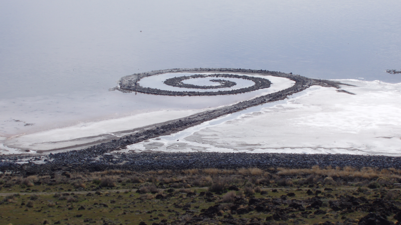
In 1970, Robert Smithson created Spiral Jetty, an earthworks piece that still remains today in the Great Salt Lake in Utah. This piece of art was a groundbreaking piece that introduced the public into earthworks, or land art.

Smithson found creation outside himself by looking to inspiration from nature. Smithson wanted to create a piece that would work with the environment. He wanted to work outside of the typical art world and work with nature, not against it. Smithson created a landscape that is actually found in a landscape. This piece is interesting because it is the juxtaposition of a man made landscape and a natural landscape. Even though this is not seen as 'typical' art, Smithson created a new type of art that was widely accepted by artists, as well as the public.

This piece shows how an artist can make something that can break the rules of art. The piece Sprial Jetty let Smithson work outside of the box, and outside of the museum. This piece is truly an original piece of artwork, that was created by an artist that found creation outside of himself. This piece has truly stood the test of time, and still stands today, even with the rising and falling of tides in the Great Salt Lake.

Image from Wikipedia.org

Thursday, October 8, 2009

Exhibition Critique

The Exhibition Typographic Exploration in Hangul at U.C. Davis Design Museum explores the culture of Korea, and their native language, Hangul. In the pieces by Hyunju Lee and Phil Choo, the two artists explore their culture and their language by incorporating their language into their works of art.
The exhibition is set up very thoughtfully, the first work of art when you walk in is entitled, Hanghui, which is about a native dance of Korea. The piece is brightly colored and most definitely catches your eye when you walk into the museum. The piece is also arranged in a circular motion, which mirrors the movement of the exhibit. When walking through the exhibit, you move around the room circularly. The first piece sets the mood for the entire exhibit, and the information about the two artists is complemented by the first piece so that the viewer understands the goals and meanings of the artists and their works.
The overall theme of the exhibition is to educate the viewer of the cultural and societal aspects of Korea. The exhibition incorporates the old traditions with the new traditions in Korea. A lot of the pieces use printing on handmade paper. This symbolizes the past and the present of design in Korea. Also by including the symbols of Hangul, the artists can teach their audience not only about the art of Korea, but the language of Korea. The symbols become part of the art in the exhibit because they are so different from our own language. By using the symbols in the artwork, the designers are introducing the western world to a new perspective. This new perspective is the Korean culture as seen by the eyes of the artists of Korea.
These two artists have successfully juxtaposed their language with their art to symbolize Korean progression in the world as well as representing the Korean Culture. The artists used their language to build a bridge between its literal meaning as well as cultural meaning behind it.

Hyunju versus Twombly


While visiting the Typographic Exploration in Hangul exhibition there was an interesting connection with Hyunju Lee's piece, Supeui Giouk-Memory of a Grove and Cy Twombly's piece, Quattro Stagioni: Autunno.
Both images use mark making as design (which is from the Latin root signare, or mark making, or to mark). Both of these images have very similar layouts, marks and lines, which makes them very interesting when they are put side by side. Both images have similar subject matter- they are both about nature but they are different on how they interpret nature.
Twombly's piece has primary colors, often found in the fall months (Quattro Stagioni: Autunno meaning Four Seasons: Autumn). Twombly has also used organic shapes such as the 'blobs' of color throughout the piece as well as the lines that run vertically down the painting. When creating this piece, Twombly used his hands to create the organic forms on the painting, which interestingly adds a sense of self to the painting, and makes it very personal. Also the juxtaposition of words and image creates contrast between man and nature.
Lee's Piece has pastel colors, most likely representing springtime in Korea in forest (The artist also has written a poem, about this forest that this piece was based on). The organic 'flower' shapes and lines that run down vertically represent the forest in an abstract way. There are also Hangul symbols that are scattered across the piece, which is most likely the poem that goes with the piece. The juxtaposition of the organic shapes as well as the Hangul symbols is mimicked by the fact that the piece was printed on hand made paper. This juxtaposition is interesting because it links the past (tradition Hangul symbols of Korea or Handmade paper) with the present (technology).
These pieces may come from different parts of the world, but they are very in tune with each other. They both use mark making as design to connect their culture and surroundings into an abstract and meaningful design.

Tuesday, October 6, 2009

Museum Visit

The museum exhibit at the Design Museum in Walker Hall at U.C. Davis is entitled, Typographic Exploration in Hangul. In this exhibit, two artists explore the language of native Korea: Hangul. One of the artists, Hyunju Lee, uses the characters of this language to evoke feelings, nature scenes, even a cultural dance.
In one particular piece, "Haha Hoho", Lee incorporates color with the Hangul symbols to describe an emotion or action, laughter. Instead of representing this action with a literal picture, Lee uses color and the symbol for laughter (in Hangul) to describe it. The shape of the piece is reminiscent of a smile. A half oval shape symbolizes the human emotion of smiling, but by using just symbols, lines and color, this emotion is de-contextualized completely. Lee describes the image as representing a sound, and by using different sizes of the symbol and lines; the artist has created depth with this piece, and has created an illusion of different kinds of laughter; whether it is loud and quiet, or a man and a woman. There is also a sense of illusion that everything is layered on this two-dimensional plane, which gives it a three-dimensional appeal to it. Also by creating a sense of positive and negative space, Lee has used mark making to create a beautifully juxtaposed image.
Laughter is a universal emotion, and Hyunju has created a piece that not only speaks to her own culture, but to cultures all over the world. The bold use of "happy" and bright colors and an aesthetically pleasing shape helps create a piece that embodies the design of this inventive artist.